
DN.04 / THE IDENTITY SYSTEMVERSION 1.0 / NOVEMBER 2026
THE BRAND GUIDE & MEDIA KIT
One identity.
Every frame.
The principles, the practical details, and the files to put DN Production into the world. A working system for designers, producers, partners and collaborators.

INDEPENDENT THINKING.
INTEGRATED PRODUCTION.
INTEGRATED PRODUCTION.
22 CHAPTERS / ONE CONNECTED SYSTEMFILES FIRST. THE PRINCIPLES BELOW.
THE HANDOFF / READY TO USE
Start with the files.
Download the complete package, or take the part you need. The online guide and PDF describe the same identity system.
ZIP / THE COMPLETE HANDOFF
Complete brand kit
The guide, logo masters, templates, fonts, palettes and design tokens.
PDF / VERSION 1.0Brand guide
The complete identity system in a portable, designed reference.
ZIP / SVG, PNG, PDF & EPSLogo library
Four configurations, four color treatments and production-ready formats.
ZIP / EDITABLE SOURCEEditable templates
Social, video, presentation and stationery layouts ready to adapt.
ZIP / FONTS & LICENSESFont package
The supplied open font files, with their original license notices.
SVG files are editable vector artwork. Logo PNG files have transparent backgrounds; template previews retain their designed fields. PDF and EPS masters support print and production workflows. Read the included README before adapting files.
THE SIGNATURE / MASTER ARTWORK
The right mark.
The right space.
Choose the configuration that fits the placement, then select a color treatment. Keep every supplied lockup intact.



THE PALETTE / EXACT DIGITAL VALUES
Quiet space.
A clear signal.
Use Ink and Paper as the foundation. Concentrate Signal Orange around the point that needs attention. Copy a HEX value or download the palette.
Ink
RGB 8 / 8 / 8
Paper
RGB 245 / 245 / 240
Signal Orange
RGB 242 / 104 / 0
Graphite
RGB 22 / 23 / 24
Signal Paper
RGB 231 / 230 / 225
Steel
RGB 140 / 143 / 143
Muted Text
RGB 115 / 120 / 115
Orange Ink
RGB 168 / 67 / 0
APPLICATIONS / EDITABLE STARTING POINTS
Take the system
into production.
Adapt the supplied layouts to the brief. Replace working content, check the placement and preserve the identity rules.
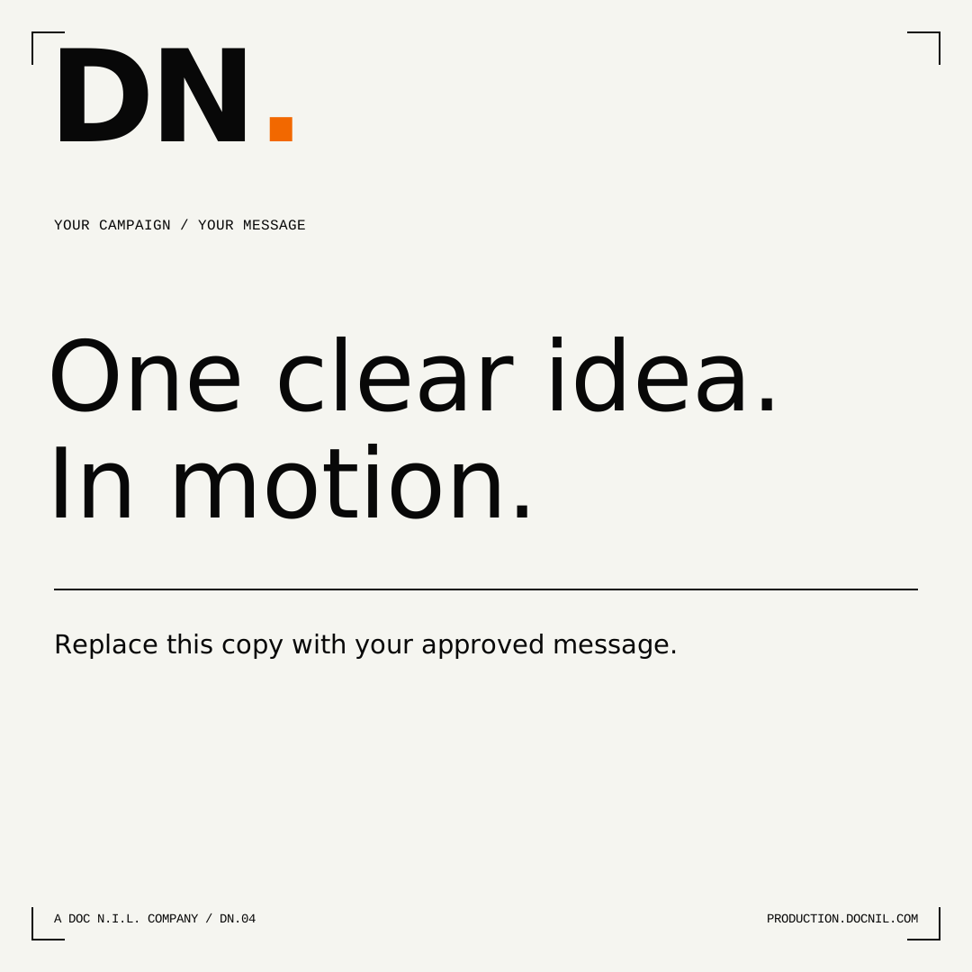
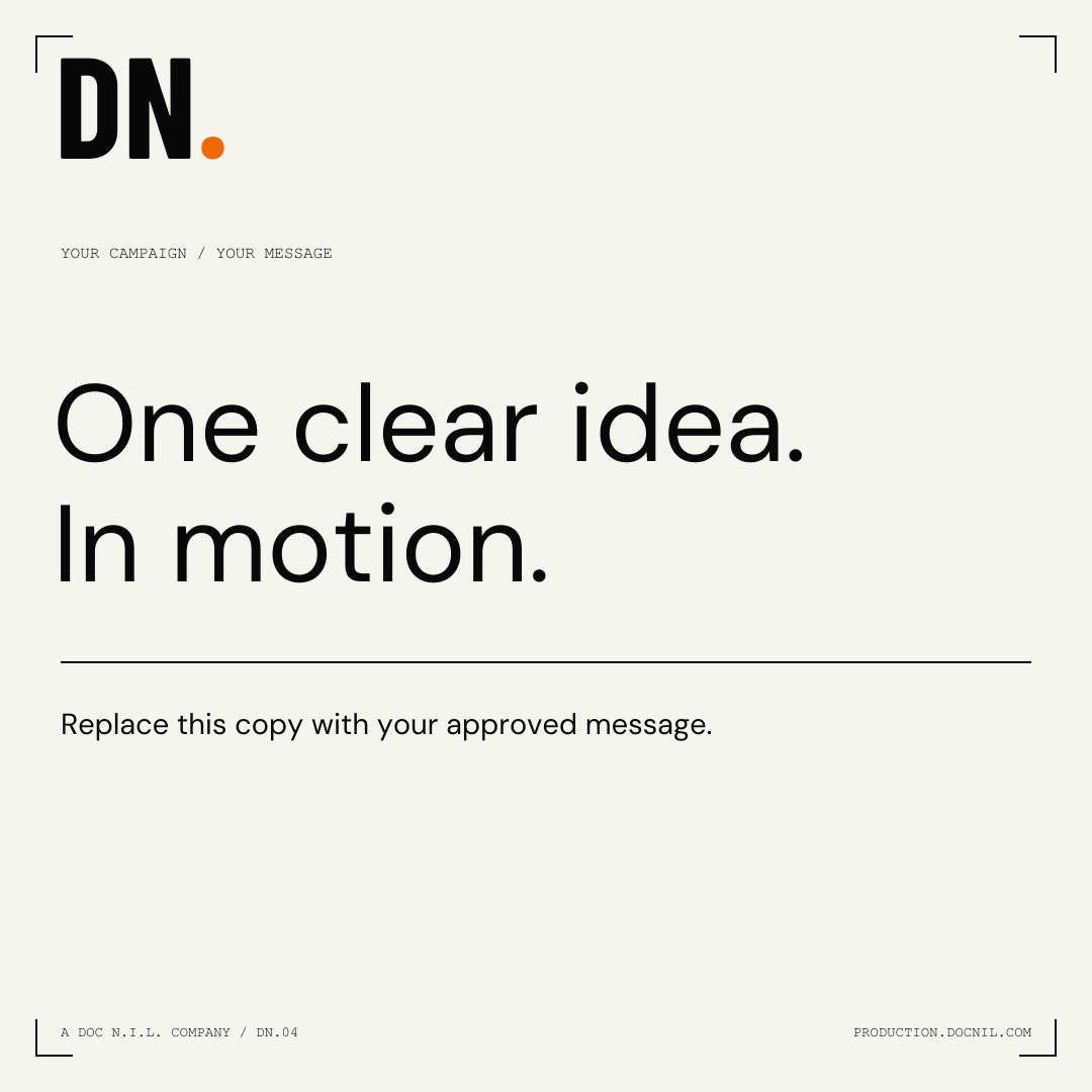
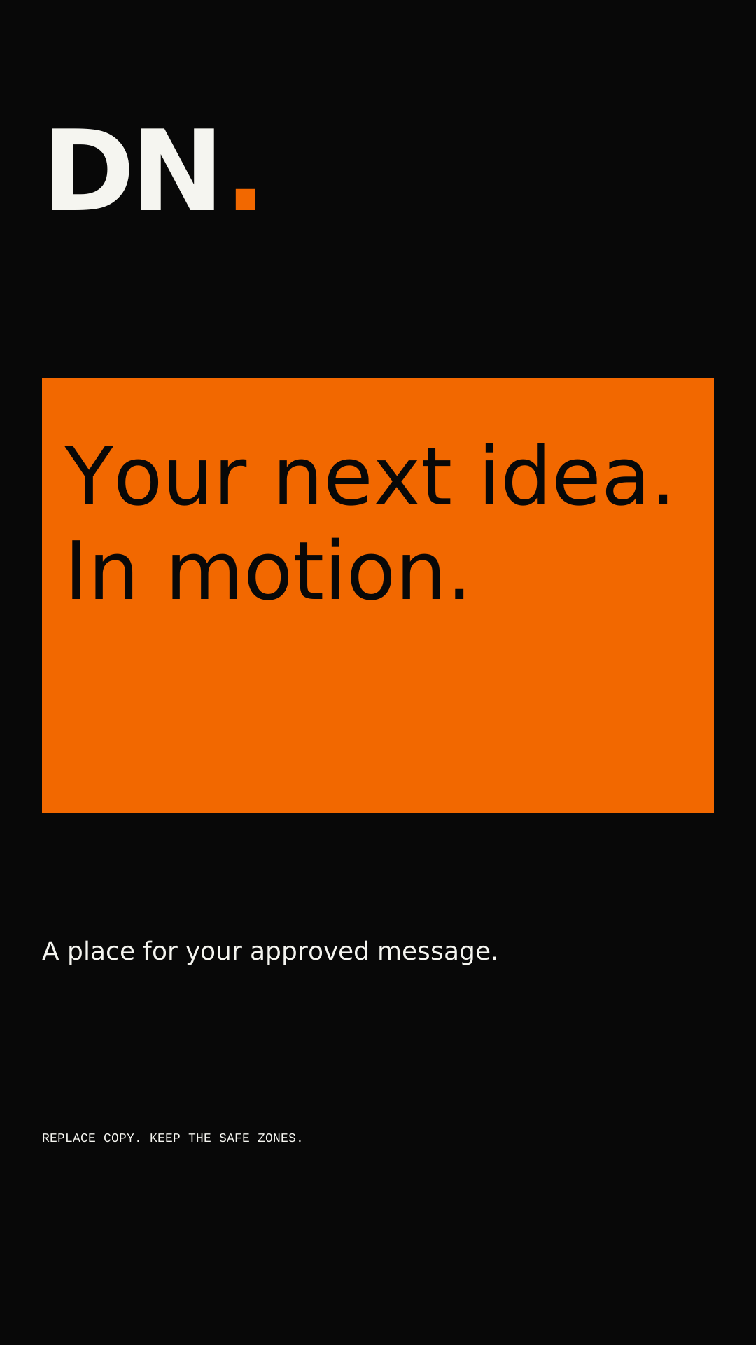
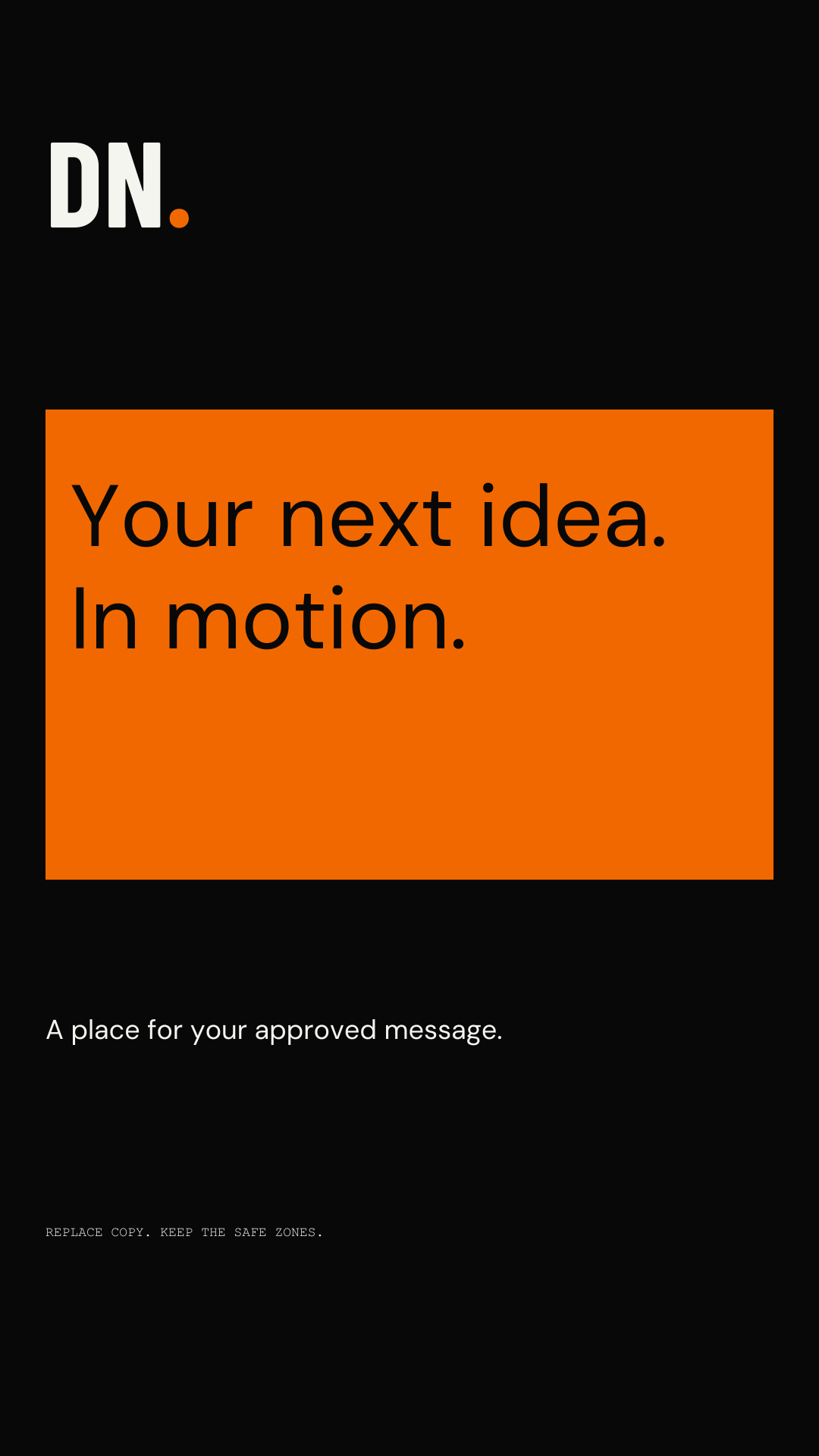
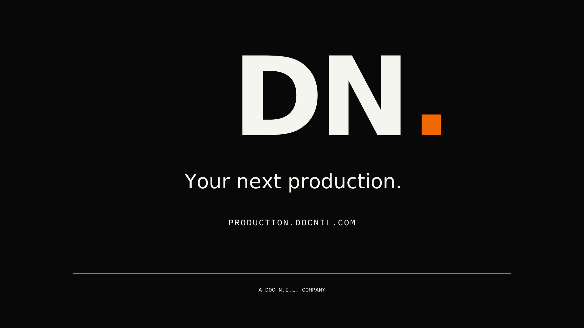
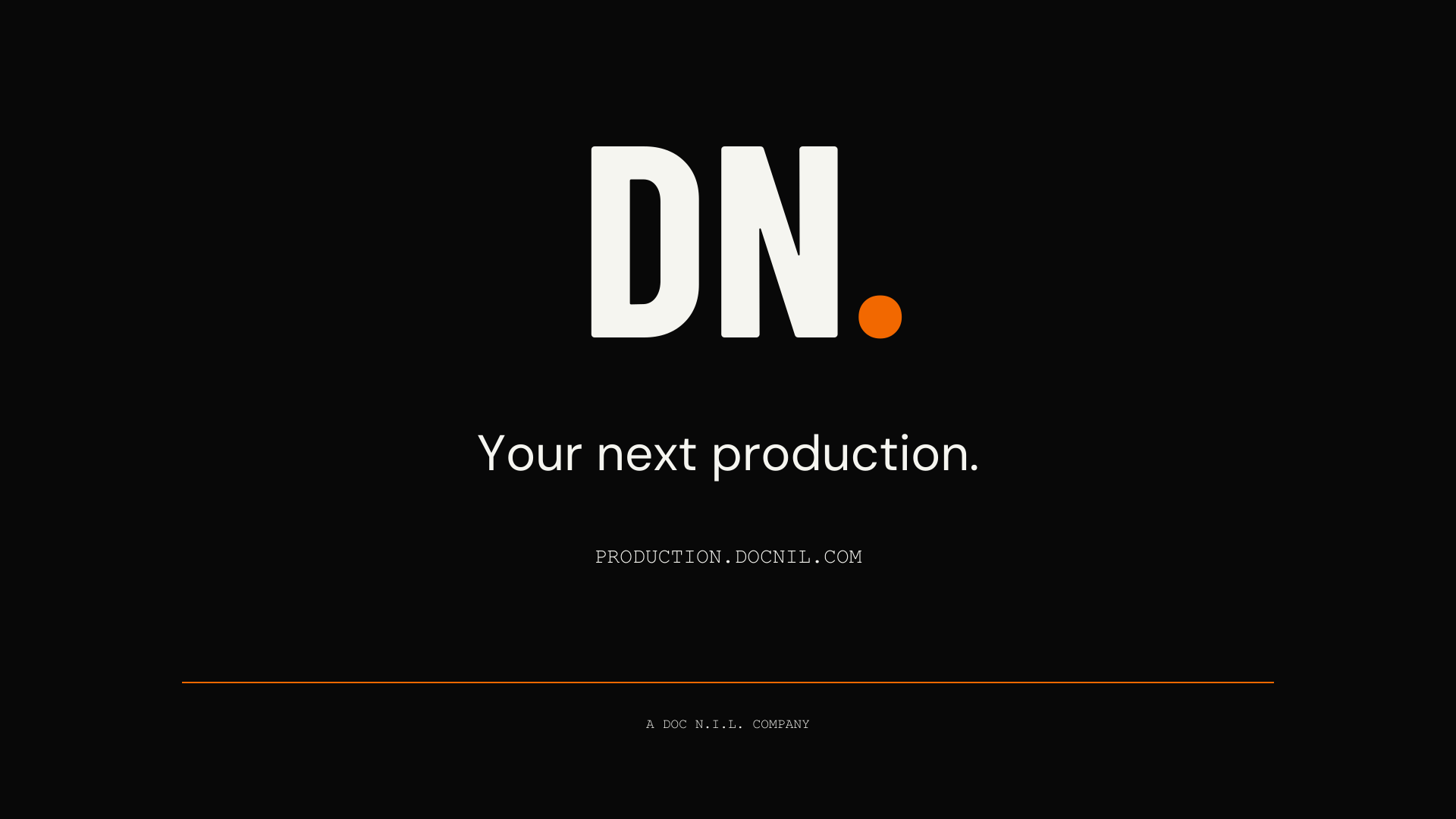
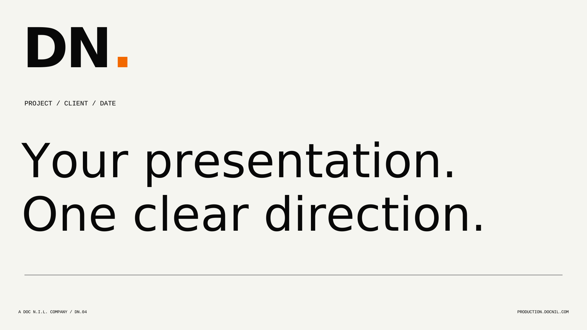
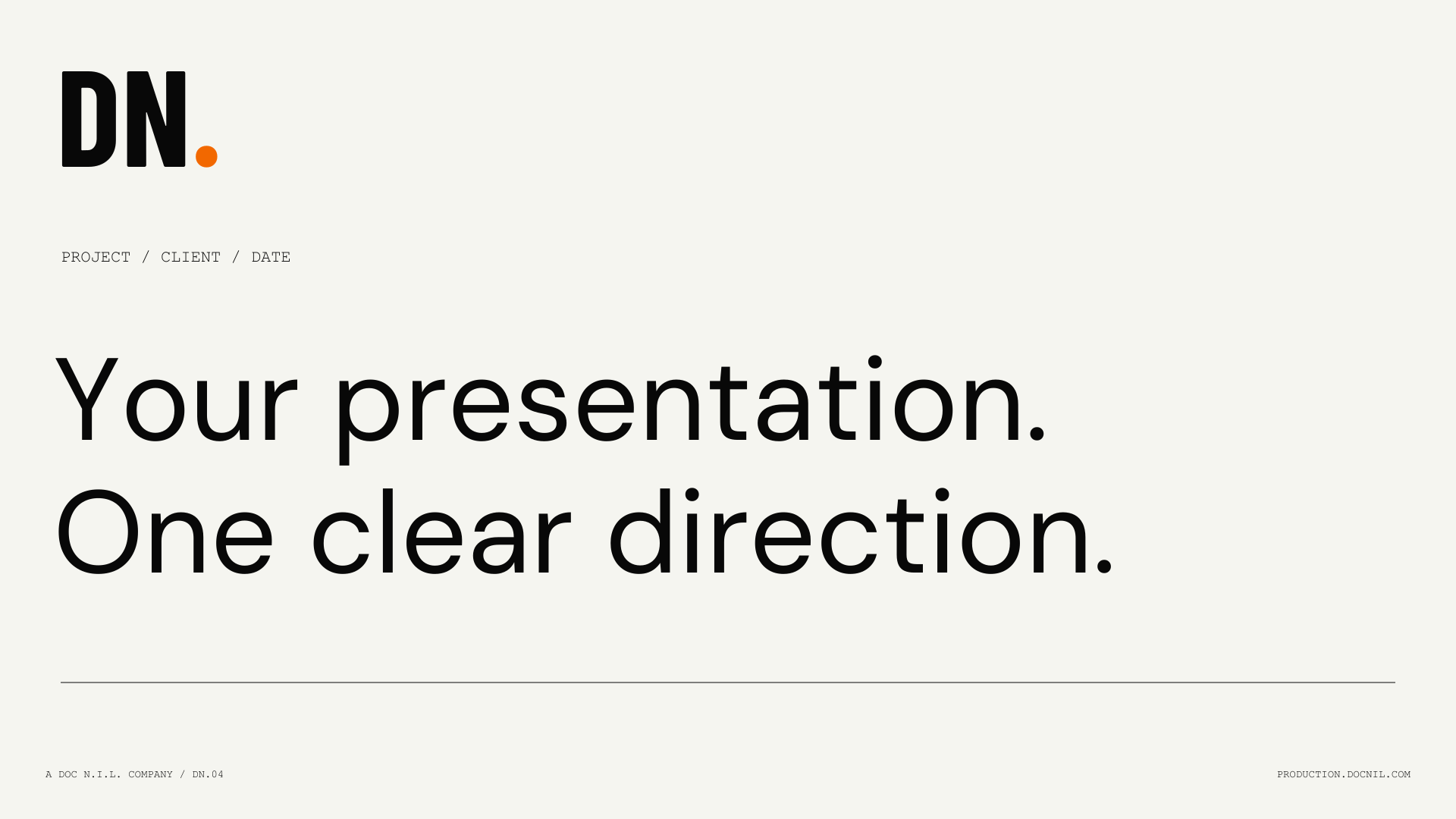
Landscape socialSVG ↓
Video lower thirdSVG ↓
Business card / frontSVG ↓
Business card / backSVG ↓
A4 letterheadSVG ↓
Email signatureHTML ↓
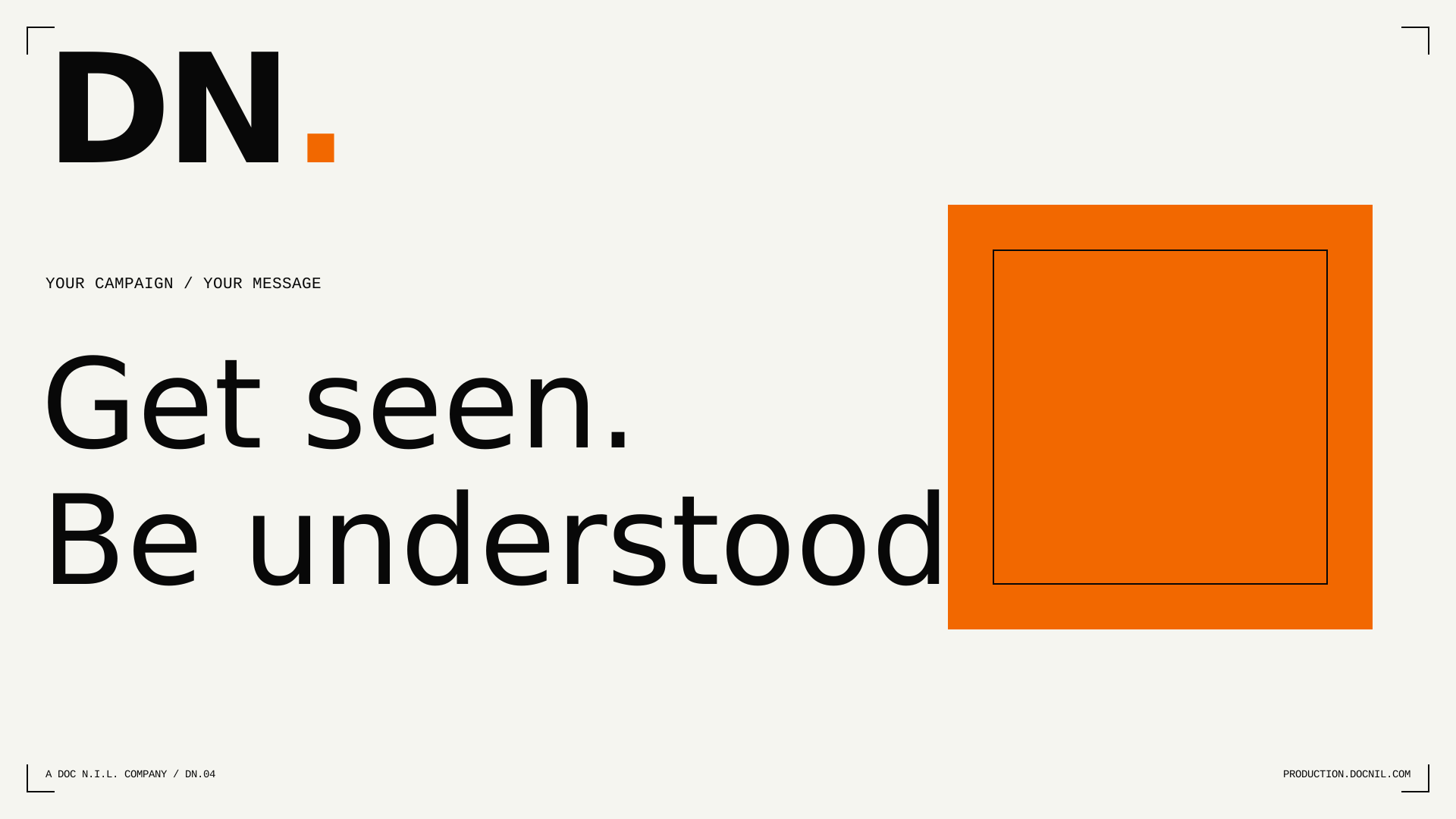

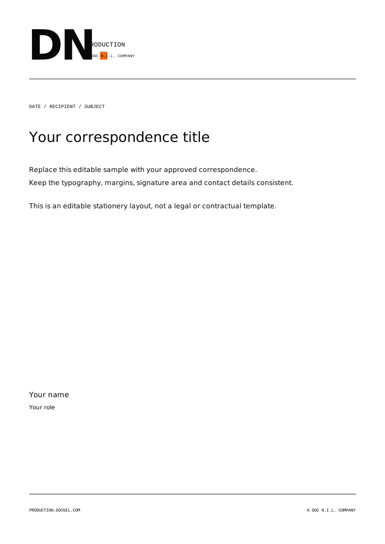
Templates are editable starting layouts. Confirm current platform specifications, safe areas, image rights and print requirements before final delivery.
01 / THE FOUNDATION
Get seen. Be understood.
A production identity with a clear job: earn attention, then make the message mean something.
DN Production is the video and film production company within DOC N.I.L. Its specialty is viral short-form social media content. The wider offer includes testimonial, explainer, SOP and training, corporate and event videos, commercials, documentaries and short films. The brand should make those capabilities feel connected, rather than presenting an unrelated list of services.
The identity combines direct typography, generous space, a disciplined black-and-paper palette and a concentrated orange signal. Large statements create an opening; considered information makes the work easy to understand. Every touchpoint should connect the audience, the idea, the production and the final delivery.
- Lead with the audience and the job the video needs to do.
- Treat attention and understanding as connected outcomes.
- Use one strong idea per composition; give supporting information a quieter role.
- This edition establishes practical production standards for the existing identity.
CORE EXPRESSION
Get seen. Be understood.
02 / WHO WE SPEAK TO
Clarity for the people making decisions.
Address brands, corporate teams and the people responsible for getting a production delivered.
Brand and marketing teams need a focused creative idea, content that suits the placement and a clear route from concept to delivery. Corporate and operations teams need accurate messages, credible people and usable training or internal communications. Producers and collaborators need an executable scope, responsibilities, approvals and delivery requirements.
Write for the decision someone needs to make next. Introduce the outcome in plain language, then explain the format, process or deliverable. Use production terminology when it creates precision, and define unfamiliar terms when the audience is broader. Keep the tone considered and human, including when a subject is technical.
- Name the audience, channel and intended outcome before choosing a format.
- Separate a creative promise from a contractual deliverable.
- Explain what a review or approval is deciding.
- Do not imply guaranteed reach, conversion, virality or business results.
USEFUL FRAMING
A clear message for the people who need to act on it.
03 / NAME & RELATIONSHIPS
One production company. A connected group.
Use the company name consistently and explain the parent relationship when it helps the brief.
The public company name is DN Production. Use that spelling in headlines, credits, proposals, filenames and introductions. The abbreviated DN. mark is a visual identifier, not a replacement for the full name in legal or contractual information. The identifier DN.04 may appear as a quiet editorial code, following the established website language.
The approved parent caption is A DOC N.I.L. COMPANY. DOC N.I.L. is the parent identity; it should not be presented as a service package or an additional production credit without context. When describing a connected delivery, identify the role of each participating company rather than merging the brands or their disciplines into one claim.
- Write DN Production; preserve DOC N.I.L. punctuation.
- Use the parent caption exactly as supplied in the master artwork.
- Keep partner and group-company marks separate and legible.
- Do not introduce an ampersand, acronym expansion, registered symbol or new tagline.
INTRODUCTION
DN Production is the video and film production company within DOC N.I.L.
04 / LOGO SYSTEM
A mark. Four working configurations.
Select a supplied master that fits the available space; never rebuild a lockup from live text.
The primary horizontal lockup is the default for websites, decks, proposals and external documents. It pairs the DN. mark with the production name and parent relationship. The stacked version is useful in compact portrait compositions. The wordmark gives the name priority where the company is being introduced. The monogram is reserved for small identifiers and contexts where the full company name is already clear.
Every configuration has a primary color version, a reverse version and single-color black and white versions. Use the same configuration consistently within a document or campaign. A monogram should not become the only identification on a first-contact brochure, a new partner announcement or a standalone document.
- Default to the primary horizontal lockup.
- Use the monogram for avatars, favicons, watermarks and small brand anchors.
- Choose a supplied stacked version instead of rearranging the horizontal artwork.
- Use the outlined SVG, PDF or EPS masters for production; use PNG when vector artwork is unsupported.
MASTER RULE
Scale the complete artwork proportionally. Do not retype it.
05 / CLEAR SPACE & SIZE
Give the mark room to work.
Protect recognition before fitting the mark into a busy layout.
Define X as one quarter of the capital height of the DN lettering in the selected mark. Keep at least X of clear space on every side of the visible artwork. Clear space is measured from the outer edge of the mark, not the edge of a document or a transparent export. Increase the allowance when another logo, a strong image edge or a large headline competes nearby.
At small sizes, use a simpler configuration. Treat the minimum sizes below as production starting points, then inspect the real output at its intended viewing distance. Fine captions and reversed artwork may require more space or a larger reproduction on absorbent stock, embroidery, engraving or a low-resolution display.
X
- Primary lockup: start at 180 px wide digitally or 40 mm in print.
- Stacked lockup: start at 96 px wide digitally or 24 mm in print.
- Wordmark: start at 140 px wide digitally or 32 mm in print.
- Monogram: start at 24 px high digitally or 8 mm high in print.
- Never reduce a full lockup until its parent caption becomes unreadable.
CLEAR-SPACE UNIT
X = 25% of the DN capital height.
06 / BACKGROUNDS & MISUSE
Choose contrast. Keep the construction.
The orange signal supports the mark; the surrounding composition supplies its authority.
Use the primary Ink-and-Orange artwork on Paper or another quiet light surface. Use the reverse Paper-and-Orange artwork on Ink or Graphite. Single-color masters are designed for processes that cannot reproduce the full palette and for compositions that need a more restrained signature. Place a logo over imagery only when its complete silhouette remains clear throughout the image or video shot.
If imagery becomes visually active, create a quiet solid-color area around the mark instead of adding an outline, bevel or glow. Avoid photographs that place a highlight behind one letter and a shadow behind another. Check reversed artwork on the actual display or substrate, not only inside a design application.
- Do not stretch, rotate, skew, crop or separate the dot from the mark.
- Do not change the letter spacing, rebuild captions or substitute a typeface.
- Do not add shadows, gradients, strokes, containers or effects to the master.
- Do not make the dot another color or place the mark on a competing orange field.
- Use single-color white or black artwork when the full-color version loses clarity.
07 / THE PALETTE
Paper, Ink, and a deliberate signal.
Use neutrals for the space. Use orange to direct attention.
Ink #080808 and Paper #F5F5F0 are the foundation. Signal Orange #F26800 is an accent for selected moments, controls, rules and emphasis. Graphite #161718 supports dark surfaces; Signal Paper #E7E6E1 creates a quieter panel; Steel #8C8F8F supports dividers and noncritical annotation. Muted Text #737873 and Orange Ink #A84300 are functional alternatives that need to be checked against their actual background.
An editorial page should normally be mostly neutral, with orange concentrated around its most important cue. An orange campaign field is possible, but it should be a purposeful exception with Ink typography and sufficient quiet space. Avoid adding unrelated accent colors to distinguish service categories. Hierarchy, numbering, space and type can do that work.
- Use the supplied HEX/RGB values for digital production and sRGB export.
- Treat CMYK values as approximate conversion references, not press specifications.
- Agree the final color profile, stock and proof with the printer.
- No Pantone match is specified in this edition; do not invent one.
- Test color in the final medium, including dark rooms and compressed video.
08 / ACCESSIBLE COLOR
A signal should still be readable.
Choose color pairs by the information they carry, not by appearance alone.
For normal-size informational text, use a contrast ratio of at least 4.5:1. For large text, the WCAG minimum is 3:1; large means at least 18 pt regular or 14 pt bold. Meaningful interface boundaries and visual states also need to remain distinguishable. A color combination passing a contrast calculation does not establish the accessibility of a whole design or website.
Ink on Paper is the default reading pair. Use Ink on Signal Orange for orange buttons and panels. Bright Signal Orange should not be assumed suitable for small text on Paper. Use the darker Orange Ink for text links when its measured contrast passes. Steel is a supporting visual tone, not the default for essential small type. Always check the final pair, size and opacity.
| Pair | Ratio | Normal text |
|---|---|---|
| Ink / Paper | 18.31:1 | Passes 4.5:1 |
| Paper / Ink | 18.31:1 | Passes 4.5:1 |
| Ink / Signal Orange | 6.44:1 | Passes 4.5:1 |
| Orange Ink / Paper | 5.54:1 | Passes 4.5:1 |
| Signal Orange / Paper | 2.84:1 | Below 4.5:1 |
| Steel / Paper | 2.98:1 | Below 4.5:1 |
- Do not encode meaning with color alone; add a label, shape or state.
- Preserve a clearly visible keyboard focus indicator.
- Measure the final color after overlays, opacity and image backgrounds.
- Keep essential captions and metadata readable at the intended size.
- Use the supplied contrast reference and the W3C guidance as starting checks.
09 / TYPE ROLES
Direct headlines. Quiet detail.
Use a small, consistent type system instead of a new font for every purpose.
DM Sans is the primary voice for headlines, body text, captions, navigation and controls. Its regular weight and tight display setting create the site’s open, direct tone. Barlow Condensed Bold provides the condensed DN lettering in the identity; keep it concentrated in brand marks and limited display accents. Informational labels use Courier New or a system monospace fallback. Do not distribute a proprietary system font as part of a project handoff.
The supplied logo masters contain outlined lettering and do not require a recipient to install fonts. Editable templates require the relevant typeface when changing live text. Include the original font license alongside redistributed font software. The DM Sans and Barlow Condensed files are governed by their included SIL Open Font License notices; that license does not grant permission to misuse the company identity.
DM SANS / REGULAREvery frame.
Part of a bigger idea.
Part of a bigger idea.
ABCDEFGHIJKLMNOPQRSTUVWXYZ
abcdefghijklmnopqrstuvwxyz
0123456789 & . , : / ( )
- Use DM Sans for long-form reading and interface text.
- Use Barlow Condensed Bold for the established mark, not as a body font.
- Limit all-caps monospace to short labels and technical annotation.
- Keep the logo as supplied artwork even when the fonts are available.
10 / TYPESETTING
Make the order obvious.
Size, measure and spacing should make a page understandable before a reader studies it.
Use one dominant display statement per screen, page or slide. In digital layouts, a display range of roughly 64-144 px on wide screens and 32-60 px on phones suits the identity; select a size that respects the available width. Start body copy at 16 px for long-form web reading and increase it when the placement or viewing distance demands. Short supporting captions may be smaller when they remain clearly readable.
Display headlines can use tight tracking around -0.04em to -0.06em and line height around 1.0-1.12. Body copy needs a calmer rhythm: line height 1.5-1.8 and a measure around 45-75 characters. These are working ranges, not a reason to compress a difficult paragraph. Edit the hierarchy or add space before reducing readability.
- Use sentence case for headlines; keep uppercase for short labels.
- Avoid justified paragraphs, very long centered copy and forced line breaks on phones.
- Keep headings attached to the material they introduce.
- Use true text for reading content; avoid baking important copy into an image.
- Check punctuation, apostrophes and line breaks in the final export.
11 / GRID & SPACE
Structure makes room for the story.
Build from a repeatable grid, then use scale and space for emphasis.
Use an 8 px spacing rhythm, with 4 px for small adjustments. A 12-column grid is a useful wide-screen starting point; collapse to four columns or a single reading column on phones. The website’s fluid 5vw outer padding is a useful brand cue. Maintain a practical minimum inset when a small screen, print trim or social crop requires more protection.
Align headings, rules, captions and image edges to shared anchors. Introduce sections with an understated number or mono label, then a larger statement and clear supporting information. Thin rules create rhythm without turning every item into a card. Avoid nested borders and decorative panels that compete with the content. A composition can be asymmetric while still following a clear underlying structure.
- Use a small spacing scale: 4, 8, 16, 24, 32, 48, 64, 96 and 128.
- Use one primary reading direction and a clear next action.
- Keep comfortable whitespace around large statements.
- Protect long text from very wide columns.
- Let the mobile layout reflow; do not scale a desktop artboard down wholesale.
12 / GRAPHIC LANGUAGE
Signals, frames, and considered restraint.
Graphic elements should explain direction or structure rather than decorate empty space.
The orange dot is a punctuation mark: a concise point of attention within a restrained composition. Hairline rules, framing corners, arrows, numbered sequences and editorial crop marks can connect the identity to production and editing. Keep their construction simple and their role clear. A useful line can connect steps or separate information; an unnecessary one only adds noise.
Use one icon family within an application, with consistent stroke weight, optical size and corner behavior. Pair unfamiliar symbols with text. Small arrows can indicate movement or a next step, but essential actions still need an understandable label. Never use an icon or a decorative frame as a substitute for required legal, delivery or accessibility information.
- Use orange for one clear cue rather than every line and icon.
- Keep rules thin and corners square unless a control requires another shape.
- Align icons optically with the text they accompany.
- Use the supplied signal elements as layout aids; do not make a second logo.
- Keep decorative graphics out of clear-space zones.
13 / PHOTOGRAPHY & ART DIRECTION
Let the subject carry the image.
Use framing, light and a deliberate point of view to give production imagery its purpose.
Favor credible people, thoughtful compositions and material that explains a story or process. Use negative space intentionally when copy or a logo shares the frame. Monochrome editorial imagery can create a quiet foundation; warm, textured imagery can provide a contrasting storytelling moment. Maintain one considered treatment within a campaign instead of applying a different look to every image.
Protect skin tone, texture and the integrity of the subject. Avoid heavy filters that flatten the image or make unrelated assets appear artificially uniform. Use a crop that serves the channel without cutting off a meaningful gesture, face or key object. Prepare a separate crop for each important ratio rather than relying on an automatic center crop.
- Keep meaningful subjects and gestures inside the intended safe area.
- Check the image at thumbnail size and at full presentation size.
- Use imagery only within its agreed license, permissions and releases.
- Do not treat example photography or artwork as included client-use rights.
- The media kit supplies identity assets and editable layout templates; source campaign imagery separately.
14 / MOTION & SOUND
Move with a reason.
Use motion to reveal depth, connect ideas and help the audience follow the story.
The motion language has a cinematic purpose: establish the composition, create a reason to move, then arrive at a clear next view. Separate foreground and background where depth helps understanding. Use smooth acceleration and deceleration, modest independent movement and restrained camera banking. Preserve the subject’s proportions and the legibility of typography. Motion should feel directed, not like a collection of unrelated effects.
Reserve immersive movement for storytelling areas. Controls, form fields, reviews and detailed reading need a stable surface. Support reduced-motion preferences and a useful still state. Essential content must remain available without animation. When sound is part of a film, give speech priority and agree music, sound design, captioning and licensing within the production scope.
- Keep interface feedback brief and readable; avoid constant idle movement.
- Use scroll-linked movement without trapping normal navigation.
- Avoid rapid flashes, exaggerated zooms and unexpected audio.
- Keep logos intact during animation; reveal a complete master rather than distorting it.
- Test the motion on a phone and with reduced motion enabled.
15 / VOICE
Clear. Human. Considered.
Speak with confidence about the work, and with care about what is being promised.
Lead with a concrete thought. Use active verbs, familiar words and a clear relationship between the audience, the idea and the production. The brand can be concise without becoming cryptic. A short headline should give the reader something meaningful; supporting copy should make the next decision easier. Let production expertise appear through specificity, not inflated language.
Keep estimates, contracts, approval requests and delivery notes especially clear. State what is included, what remains to be decided and what the recipient should do next. Avoid vague claims such as premium, innovative or best-in-class when the sentence can describe the actual work. Never imply an endorsement, a result or a commercial commitment that has not been agreed.
- Write in sentence case and use one main idea per paragraph.
- Prefer a precise deliverable to a superlative.
- Use the full company name on first reference.
- Keep claims, scope, usage and timing accurate.
BEFORE
We deliver revolutionary, best-in-class content solutions.
AFTER
We shape the idea, produce the video and deliver the versions your channels need.
16 / MESSAGE & CALLS TO ACTION
One clear idea. One clear next step.
Match the message to the stage of the conversation.
The brand-level expression is Get seen. Be understood. Use it where a broad statement about the company is appropriate. Video. Film. Social. is a useful discipline descriptor. Independent thinking. Integrated production. describes the working approach. Supporting copy should connect the expression to an actual audience, format or production need rather than repeating the same headline in several places.
Use action labels that describe what will happen. Request a project quote is appropriate for an inquiry. Explore our video services is appropriate for discovery. Download the brand kit is appropriate for a direct asset download. A document that prepares an email should explain that handoff accurately rather than suggesting the inquiry has already been submitted or approved.
- Use one primary call to action per composition.
- Name the destination or action; avoid vague labels such as click here.
- Separate an inquiry from a confirmed booking or agreed scope.
- Use existing brand expressions exactly; do not combine them into a new tagline.
COMPANY HEADLINE
Get seen. Be understood.
PROJECT INVITATION
Start with the audience, the idea or the challenge.
18 / PRINT & PRESENTATIONS
A consistent system beyond the screen.
Carry the same clarity into a business card, letterhead, proposal or presentation.
The stationery templates establish the relationship between the logo, contact information, rules and quiet space. Keep details accurate and replace template fields before issuing a document. Use the A4 letterhead as a starting layout, and confirm local paper sizes when preparing another market. Business-card artwork must be checked against the chosen printer’s trim, bleed and safe-area requirements.
Presentation slides need a single clear purpose. Use a strong title, a limited amount of readable text and one primary visual when it serves the story. Use section-divider slides to reset the pace. A proposal should distinguish the creative approach, scope, deliverables, review rounds, usage, schedule and commercial terms. A brand template does not replace a reviewed project agreement.
- Use vector logos in print and export a proof PDF before production.
- Confirm bleed and output profile with the supplier; do not assume a universal preset.
- Use simple document styles so updates remain consistent.
- Check presentation type at real viewing distance.
- Keep editable source files separate from final approved delivery files.
19 / DIGITAL & ACCESSIBILITY
Make the brand easy to use.
Recognition matters most when a person can find, read and act on the information.
Use semantic heading order, descriptive link labels and meaningful text alternatives for informative images. Keep logos and decorative shapes out of unnecessary announcements to assistive technology. A download link should identify its file or destination; give users a clear route back to the page they were reading. Avoid making navigation dependent on hover, a particular gesture or animation.
Build responsive layouts that reflow cleanly on phones. Keep forms stable while people enter information, label fields explicitly and communicate errors in text. Test keyboard navigation, focus visibility, zoom, text contrast and reduced motion. Use lightweight SVG for identity assets where possible, and export raster imagery at the size the placement needs instead of relying on oversized files.
- Use visible labels and sufficiently large interactive targets.
- Test long headings, real form content and error states at narrow widths.
- Keep essential information available when scripts or motion are unavailable.
- Use sRGB for web graphics and preserve transparency where needed.
- A brand checklist supports accessibility work; it does not replace a complete audit.
20 / PARTNERS & CREDITS
Make each relationship understandable.
Give the audience clear roles and give each identity appropriate space.
In joint communications, establish who is presenting, producing, commissioning or supporting the work. Choose the lead identity based on the communication’s owner and purpose. Keep marks at a comparable optical weight when the relationship is equal, while preserving each organization’s supplied clear-space requirements. A visual balance is more useful than mechanically forcing equal bounding-box widths.
The DOC N.I.L. relationship can be expressed using the supplied parent caption. External partner marks should remain independent artwork. Do not combine their letters or symbols with the DN. mark, or create a new group lockup without a specific approval. In film credits, use agreed company names, individual roles and ordering. A campaign graphic is not evidence that an organization endorses a claim.
- Define the relationship in words before arranging logos.
- Separate marks with whitespace or a simple neutral rule.
- Obtain the partner’s current master artwork and relevant usage instructions.
- Keep credit, license and commercial approval records with the production.
- Approve a new co-branded arrangement before releasing it.
21 / FILES & RIGHTS
Use the right file. Keep the source.
A professional handoff should be understandable without reconstructing the design process.
Use SVG for editable web and design layouts, PDF for vector placement and proofing, EPS for compatible legacy production tools and transparent PNG for applications that do not support vector artwork. The logo archive contains the supplied configurations and color versions. The complete kit also contains templates, palettes, design tokens, this guide and file documentation. Preserve the folder structure so collaborators can find the master they need.
Keep original masters separate from campaign adaptations. Use descriptive lowercase filenames for working assets and add a version or approval status when circulating new production work. Include the original font licenses with redistributed font files. Access to the kit supports authorized DN Production communications; it does not create a partnership, an endorsement or permission to alter the brand identity.
- Choose the smallest appropriate format without sacrificing required quality.
- Do not use a screenshot as a logo master.
- Do not assume identity downloads include rights to client photography, talent or music.
- Keep a record of project-specific permissions and approvals.
- Read the kit README and manifest before handing files to another supplier.
WORKING FILENAME
dn-production_project_asset_ratio_v01.ext
22 / RELEASE CHECKLIST
A final check before it leaves the studio.
Consistency is the result of specific decisions checked in the final medium.
Use this checklist at the end of a design, export or production handoff. Review the actual final file, not only the editable source. Confirm that every logo, font and linked image is present. Check the real crop, type size, contrast, page sequence and file format. A proof on one screen does not establish how an asset will print, compress or appear inside a platform interface.
This is edition 1.0, November 2026. Retain this edition with the files it documents. When the identity system changes, update the guide, assets and manifest together, then replace outdated distribution copies. For a campaign-specific exception or a new lockup, record the decision and responsible approver so the next collaborator has a clear source of truth.
- Correct company name, parent caption and approved logo master.
- Clear space, minimum size, readable type and checked color contrast.
- Accurate copy, contact information, scope and calls to action.
- Correct dimensions, safe area, export settings and naming.
- Rights, permissions, proofing and project approval completed.
- Editable source, final output and relevant license files included.
REFERENCE / RIGHTS & ACCESSIBILITY
Keep the references with the work.
Font files remain subject to their included license notices. The following primary references support the typography and contrast guidance.
READY FOR THE NEXT FRAME
One source.
Ready to hand off.
Keep the guide, master files and license notices together. Use the manifest to identify what is included, and the README to choose the right format.
DN PRODUCTION / BRAND GUIDE & MEDIA KIT / VERSION 1.0 / NOVEMBER 2026
17 / SOCIAL & VIDEO
Design for the frame it will live in.
Start from the intended placement and build the hierarchy around the viewing conditions.
The editable social templates cover square, portrait story and landscape compositions. Use the square 1080 x 1080 frame for a balanced feed composition, the 1080 x 1920 frame for portrait storytelling and the 1920 x 1080 layout for a wide editorial card. These are working artboards, not a guarantee of acceptance by every current platform or ad placement.
Keep essential text and the logo away from outer edges and interface overlays. Use a generous central safe area in portrait content, then verify the live placement’s current crop and controls. For 1920 x 1080 video graphics, protect critical information within roughly 10% of each edge as a conservative starting point. Subtitles need their own readable position and adequate contrast.